Across the globe, only a handful of brands achieve the level of instant recognition and cult following that Apple enjoys. Apple’s brand identity transcends being a mere logo; it has become a symbol that mirrors the company’s transformation from a humble Silicon Valley startup to a dominant force in the tech industry. The Apple logo, characterized by its sleek and straightforward design featuring an apple with a bite taken out, is known and admired universally. Here’s a peek into the evolution of the iconic logo.
The Original Logo:
The original Apple logo, designed by Ronald Wayne in 1976, depicted Isaac Newton sitting under an apple tree, with an apple about to fall on his head. The logo included a quote / from William Wordsworth: “Newton… A mind forever voyaging through strange seas of thought… alone.” This intricate and detailed logo was quickly deemed too complex for branding purposes.
The Rainbow Apple:
A year later, Steve Jobs enlisted Rob Janoff to create a more minimalist logo. Janoff’s ingenious design—a stylized apple with a bite mark and vibrant rainbow stripes—was both simple and striking. The bite was not just a design choice; it served to differentiate the apple from other fruits and cleverly referenced “byte,” a unit fundamental to digital information. This logo became synonymous with Apple’s innovative spirit and accessibility, particularly highlighting the Apple II’s pioneering color graphics.
The Modern Logo:
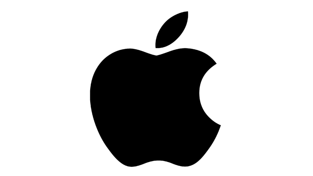
In 1998, to keep up with the company’s sleek and modern image, Apple replaced the rainbow design with a monochromatic, translucent logo. This shift coincided with the launch of the iMac G3, which came in a variety of colors but had a unified and modern aesthetic. Over the years, the logo has seen slight modifications in its texture and color, but the basic design has remained the same.
In 2007, Apple changed the logo to a chrome-textured design to go with its upcoming aluminum-based products.
Myths and Interpretations
Several myths and interpretations have sprung up around the Apple logo:
- The Alan Turing Theory:
One popular but unverified myth is that the bite in the apple is a tribute to Alan Turing, the father of modern computing, who dies by suicide by eating a cyanide-laced apple. This story, while compelling, has been denied by Rob Janoff and Apple. - Biblical Reference:
Another interpretation is that the bitten apple represents the Biblical story of Adam and Eve, the first humans created by God and were. Placed in the Garden of Eden, they were given everything they needed. However, they were also given one commandment: not to eat the fruit from the Tree of Knowledge of Good and Evil. However, Eve decided to eat the forbidden fruit and shared it with Adam. This act of defiance, often depicted as eating an apple, can be seen as a metaphor for human curiosity and the desire to push beyond established boundaries. This aligns with Apple’s ethos of challenging the status quo and thinking different. - Simple Design Choice:
According to Rob Janoff, the real reason for the bite was purely practical: it was to clearly distinguish the apple from other round fruits (such as cherry) and to make the logo instantly recognizable. The bite also plays on the word “byte,” a fundamental unit of digital information.
The Apple logo’s simplicity, elegance, and versatility have contributed to its lasting impact and recognition, making it one of the most famous and enduring logos in the world. The logo with a bite is more than just a visual identifier; it’s a cultural icon that transcends borders and languages. It adorns millions of devices worldwide, from the sleek MacBook Pro to the revolutionary iPhone, serving as an icon of innovation and quality craftsmanship.